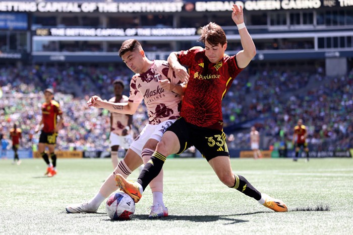
Sports
Jun 14, 2010 at 9:44 am
Comments
Please wait...
Comments are closed.
Commenting on this item is available only to members of the site. You can sign in here or create an account here.
More In Sports

Editors' Picks


Popular Articles
is a proud member of the
 media network
All contents © Index Newspapers LLC
PO Box 86208, Portland, OR 97286
PO Box 86208, Portland, OR 97286
One of these things is not like the other.
http://img25.imageshack.us/i/circularfootb…
The tactics may not have been the best. Certainly they were offensive. The sentiment though. That's real.
I'm kinda surprised Graham's top-drawer trolling hasn't drawn out the more letssayvocal fans, but at 1 pm, they're probably still in bed in the basement on their mom's old futon, watching Italy's WC game on justin.tv.
I saw the thing the night before, had formed an opinion, and had also heard the Timbers front office's response to anyone expressing concern about the new badge in an adult manner which was pretty much, "fuck you you don't know what you're talking about." That message was heard loud and clear by a very vocal group.
@CC
It totally resembles old Supersonics stuff.
it looks like something from arena football, or that lacrosse league that was around for a while (or still is?). it's "kinda disco", in a bad way. I think that it's trying too hard. it's apparently the job of graphic designers to come up with "something new". personally the old emblem had a lot of history, and was delightfully understated. for instance, WTF is the triangular element in the background there for? it harkens back to some elements from the original, but brings them to much to the foreground. why? the old emblem could've been updated, and even 'modernized' without losing it's heart. didn't happen here.
OK, so maybe I'm a little anal about alot of this stuff, but graphic design is sort of a hobby of mine, and I honestly think that most often it's way too forced. that's how I feel about this logo. maybe I'll think on it a little more and update this.
but don't count on it.
http://www.flickr.com/photos/muddyravine/5…
Yeah, I don't get this resentment at all. The new one's cheesy like an indoor lacrosse logo - but no more so than it was before. Again, I'm saying this as a casual Timbers fan, not a hater.
Here's my take. The old logo had a really ugly, fuzzy looking font. That absolutely needed to be updated. There was also a pretty bad looking color scheme since the old color of green had a really yellowish tint to it. This new logo is really clean and crisp from a color and font standpoint. They also incorporated a lot of white into it, which is really different from the old logo- again this does a really nice job of separating the green from the yellow. Also consider the Timbers' uniforms- the most prominent color on there is a forest green with white trim. The only yellow on it is from the logo, which from far away just makes it look like a little stamp. I'm more surprised they didn't entirely eliminate that color, but it is certainly de-emphasized in the new logo in favor of more green and white, especially prominent in the axe which is now all white with some yellow shading. I also like how much vector is used on the new logo; it'll save the Timbers' designers a hell of a lot of work and will keep the logo more consistent in all the media they need to use it on. On that note, the one thing I do dislike about the new logo is how warped and elongated the blade of the axe looks in order to stretch it out enough to "break out" of the crest. The one weird thing is that the promo video for the unveiling mentioned the background as "three chevrons" but it seems clear to everyone here that it looks a lot like Mt. Hood, which I like a lot nicer.
Some other things to keep in mind here.. This is fairly consistent with how the MLS logos look: http://www.mlssoccer.com/league/clubs . And no matter what you think about the Timbers' logo, it's miles ahead of the Columbus Crews' and the New England Revolution. It's also in line with how American sports marketing looks like; aside from baseball and to a certain extent American football (which didn't come into its own until the 50s/60s itself) there's not a sport which is firmly entrenched into this particularly country's history much like those other circular badges that BlackedOut had the audacity to compare the Timbers to.
And again, as for me, being a casual-but-getting-more-and-more into-the-Timbers fan, you're going to need a logo which will attract enough people to not think of the team as "minor league" and can fill up that stadium to capacity. I know the Timbers have a great attendance for the USL (only second to Montreal!), but they're still averaging 8.6k even after that incredible opening of nearly 16k. PGE Park is going to have a capacity of 22k. They've got a long way to go there, but the logo is a good start.
This logo is minor league. The old logo was classic. Look at baseball for a guide. The Yankees, Red Sox, Cubs, and Dodgers have the strongest brands: all simple, classic, understated logos. The teams with the weaker brand identities have flashy, bold, hypercolored logos that look a lot like what most minor league baseball teams sport. Look at the NBA: the Lakers and Celtics have the strongest brands. Teams that are constantly trying to keep up with the latest fashions have the weakest. This is a fail, plain and simple. Classic may not be the most exciting choice at any given time, but in the long run, consistency is what gives you a strong brand identity. And you can't have consistency with this logo, because it was unveiled on Saturday and four days later it already looks dated.
Teams that are constantly re-working their logo are not failing as a result, it's the other way around. I gave several graphic design related reasons why the new logo is better than the old one and you counter with saying the old one was "classic" and thus better. Yes, it was also bush league and looked like it was designed in Photoshop 6.0, which is likely given that was when it was made and it looks like a bitmap image.
i like the new logo. not as much as the old logo, but it could have come out much worse. like the previous timbers logo from 2002 or so.