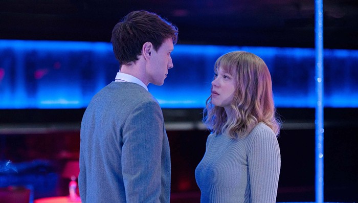
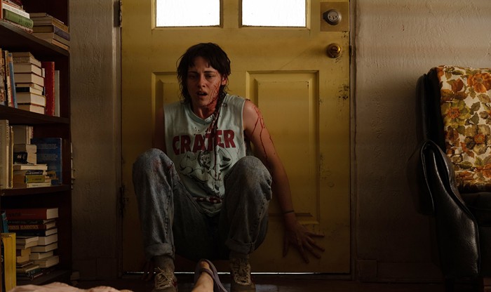
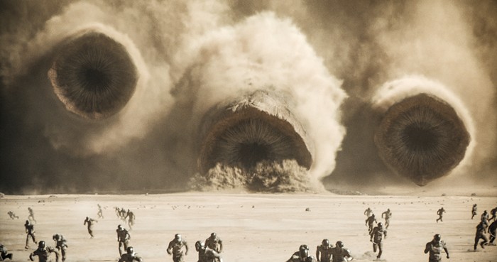
When the early film industry realized this prime cinematic real estate might be good for something besides introducing the cast and crew, the art form began to flourish. Music, imagery, and typography were combined to develop mood. Free to move beyond a dry listing of names, credit sequences have become both a playground and a rewarding showcase for designers.
In For Openers: The Art of Film Titles, collectors David Peters and Ken Coupland alternate their most intriguing and ambitious clips with discussion of the trends, innovations, and highlights of the last 50 years. Their retrospective is a rarity--considering the current hype for multi-media, it's surprising there are so few collections available to film buffs and graphic artists.
The variety of approaches is amazing. Some credits, like those that open the James Bond movies, simultaneously provide a trademark, reminder of past thrills, and a stylish glimpse of the film ahead. Directors have used credits as efficient shortcuts, condensing time to reveal history, or established tone by languidly dwelling on a pivotal or symbolic moment. A few of the most memorable involve only the interplay of text and a few minimal graphic elements.
Perhaps the most gratifying aspect of tracking these clips through time is the realization that very few approaches have actually been abandoned. New developments haven't replaced the old. Current films still offer everything from the most austere text treatments to photographic still-lifes to flickering, degenerated jump cuts. It's heartening to discover this rather isolated corner of graphic art, where form and function are equals and "forward in all directions" is the operating principle.
